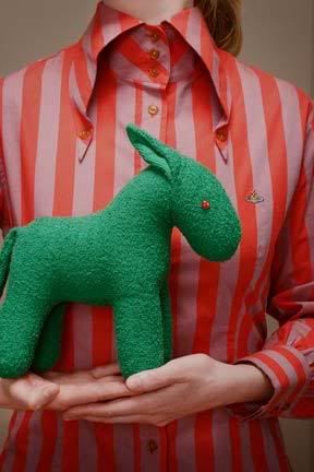
I may just be trying to find the silver lining in an exceedingly dark and ominous cloud but the lack of consumers actually consuming does seem to have one bright side to it...not the generous reductions that we'll be seeing in the sales (because those are somewhat marred by the fact that most of us have neither the money to spend nor any enthusiasm for handing over what little we have)...no, the welcome side effect in question is an increased creativity in the Fall advertising campaigns. That's right, in an attempt to lure us out of our shopping bunkers, there seems to be a push to move beyond the same old ads that seem to appear year in, year out. The first example of this was the Louboutin ads that I mentioned last week...the second, these architecturally themed beauties from Hussein Chalayan.
Things, at least in print, are definitely looking up...
Tuesday, June 09, 2009
Labels:
advertisements
Posted by
Hebden
6:08 AM
DIGG it! -
STUMBLE this! -
Add to DEL.ICIO.US!
Subscribe to:
Post Comments (Atom)


Post a Comment 0 comments: